Until early 2025, Kalvium's existing platform served its purpose, allowing students across 17+ university campuses and 50+ squads to view courses and consume learning materials, including quizzes and assignments.
However, with anticipated student admissions and the need for significant growth, it became abundantly clear: we needed to scale, incorporate new features, revamp the tech stack, and, crucially, deliver a fresh, enhanced experience. This wasn't just a facelift; it was a fundamental re-architecture of the student journey.
We rolled up our sleeves, and that’s how Livebooks v2 was born.
To build the right thing, we first had to understand what needs to be improved. My first question was simple:

What makes accessing content so difficult for our students?
To answer this and to define the necessary scope and ensure we were building the right Livebooks, the critical step was answering the fundamental systemic question: What was wrong with Livebooks v1?

Overwhelming Information: Students described the main page as a cluttered "pack of a single page."

A Broken Learning Flow: Users had no easy way to resume learning from where they left off. This friction in getting back to their work was a constant source of frustration.

Inconsistent Tests: Quizzes and assignments, while present, lacked a consistent and clear user experience, leading to potential confusion

Lack of Clarity: Students needed more information about session delivery times and a way to track their attendance, factors directly impacting their academic outcomes
To bring these pain points to life, I framed them as user stories, which became a guiding star, and an actionable foundation to build upon:

As a student, I want to see all the subjects I enrolled for in a common place so that I can easily access them.
As a student, I want to see all the planned sessions for a subject so that I can plan and prepare accordingly.
As a student, I want to see all my previous attempts of quizzes and assignments so that I can refer to them when required.
From these, we distilled our core problem statement:
Students need a clear, centralized, and distraction-free way to manage their subjects and learning materials, enabling them to stay organized, track their progress, and focus on what matters most: learning.
With this problem in focus, I began to generate ideas by framing our challenges as opportunities, asking:

How might we provide a clear overview of a student's entire curriculum?
How might we create a seamless flow for resuming learning and tracking progress?.
How might we design a focused, distraction-free environment for content consumption?.
Our user insights indicated that the existing content structure was a bottleneck. Previously, a 'course' was loosely connected to a 'Learning Unit' (LU), with all content residing under a 'Learning Path.' This needed a radical rethink. In close alignment with our development team – a crucial collaboration that always pays dividends – we made the significant decision to deprecate the old 'courses' and introduce a more flexible 'subjects' structure. This wasn't merely a naming change; it enabled delivery optimization across different campuses
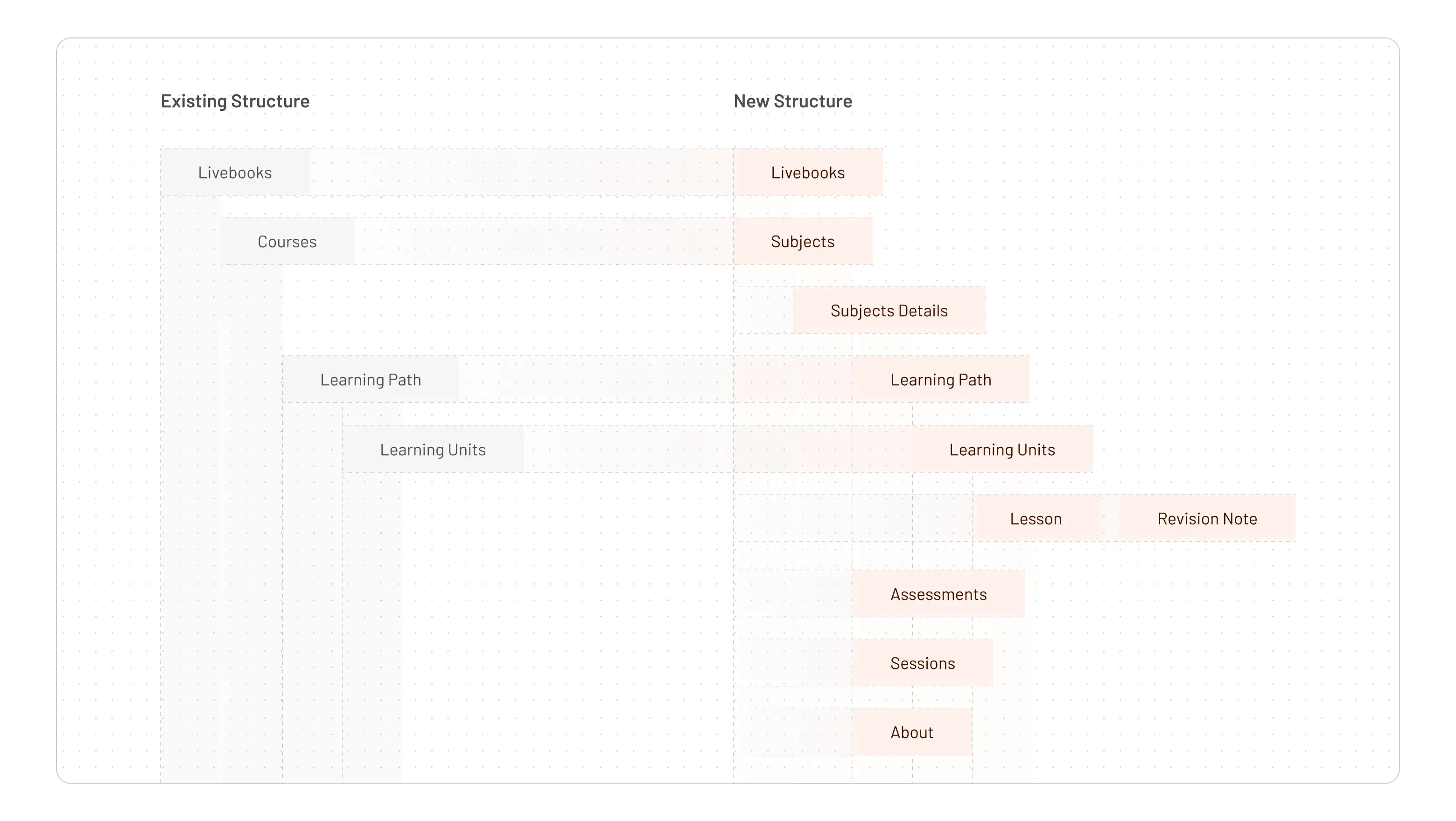
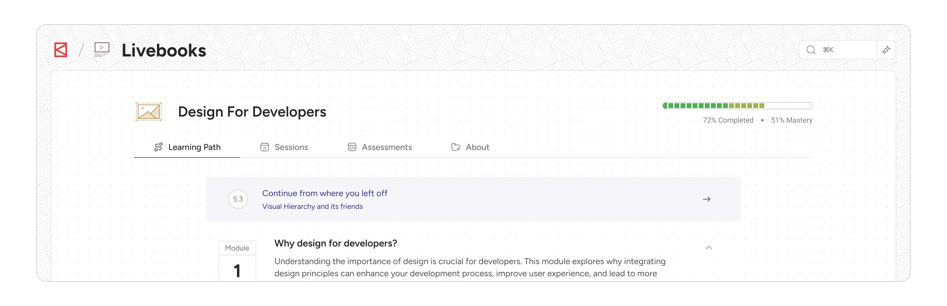
The most impactful structural change was segregating subject details into four distinct, intuitive tabs: Learning Path, Sessions, Assessments, and About. This directly addressed the "overwhelming information" problem by breaking down content into digestible, contextually relevant chunks. This was a deliberate move away from the "pack of a single page"
Since this was a major shift, we worked closely with the development team to ensure the system could still support existing courses while adopting the new structure
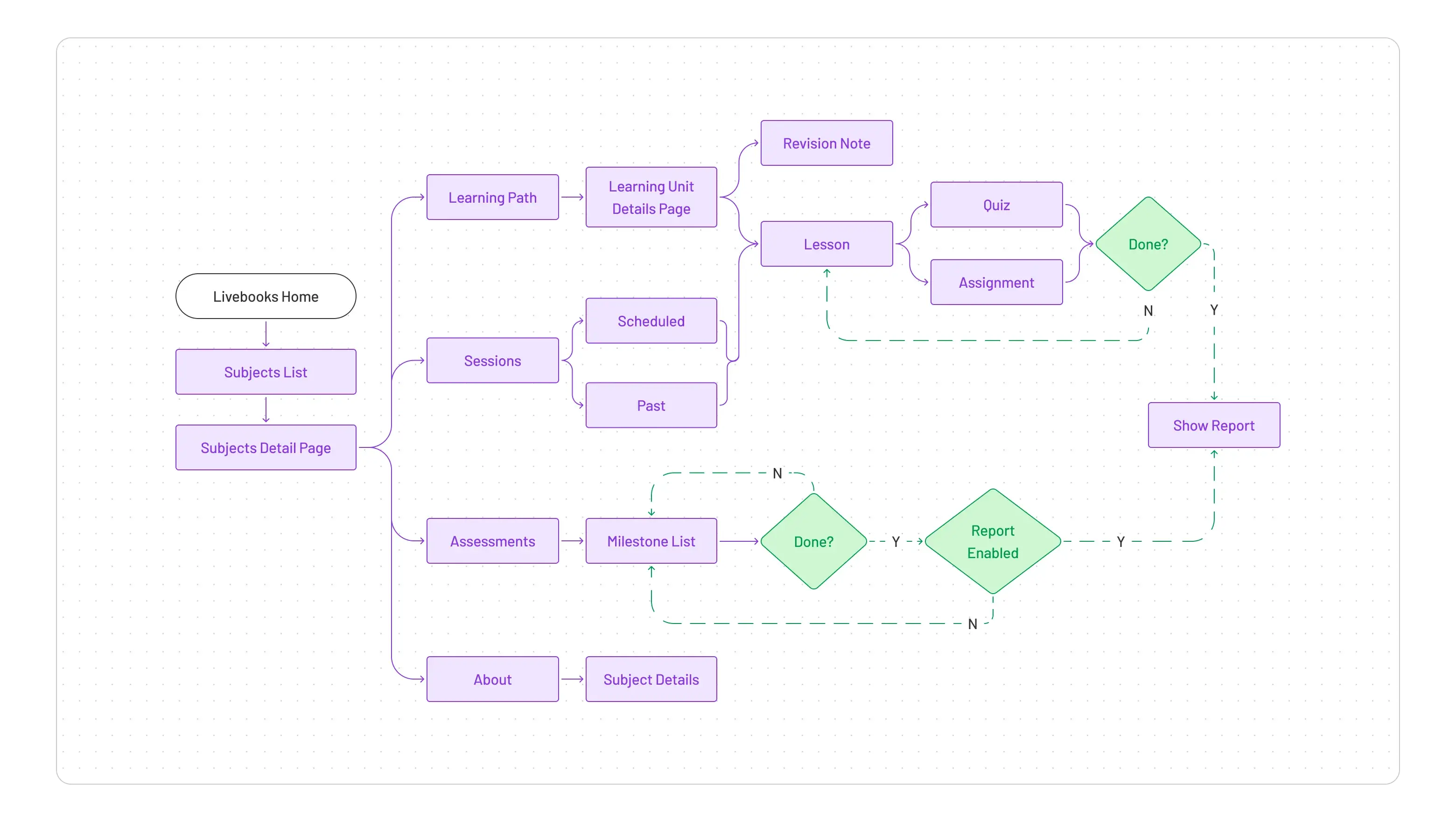
I began sketching — moving quickly, without overthinking — to explore layouts that could work for different personas. We wanted the experience to be focused yet engaging, with touches of gamification to keep students motivated. I mapped out the happy path for students: from the dashboard to a subject, into a learning unit, and through to an assessment. This clarified every touchpoint and ensured smooth navigation.
Enhanced Learning Path: The Gateway to Knowledge
The "Learning Path" tab is where students spend most of their time, and our goal was to make it as intuitive and efficient as possible.
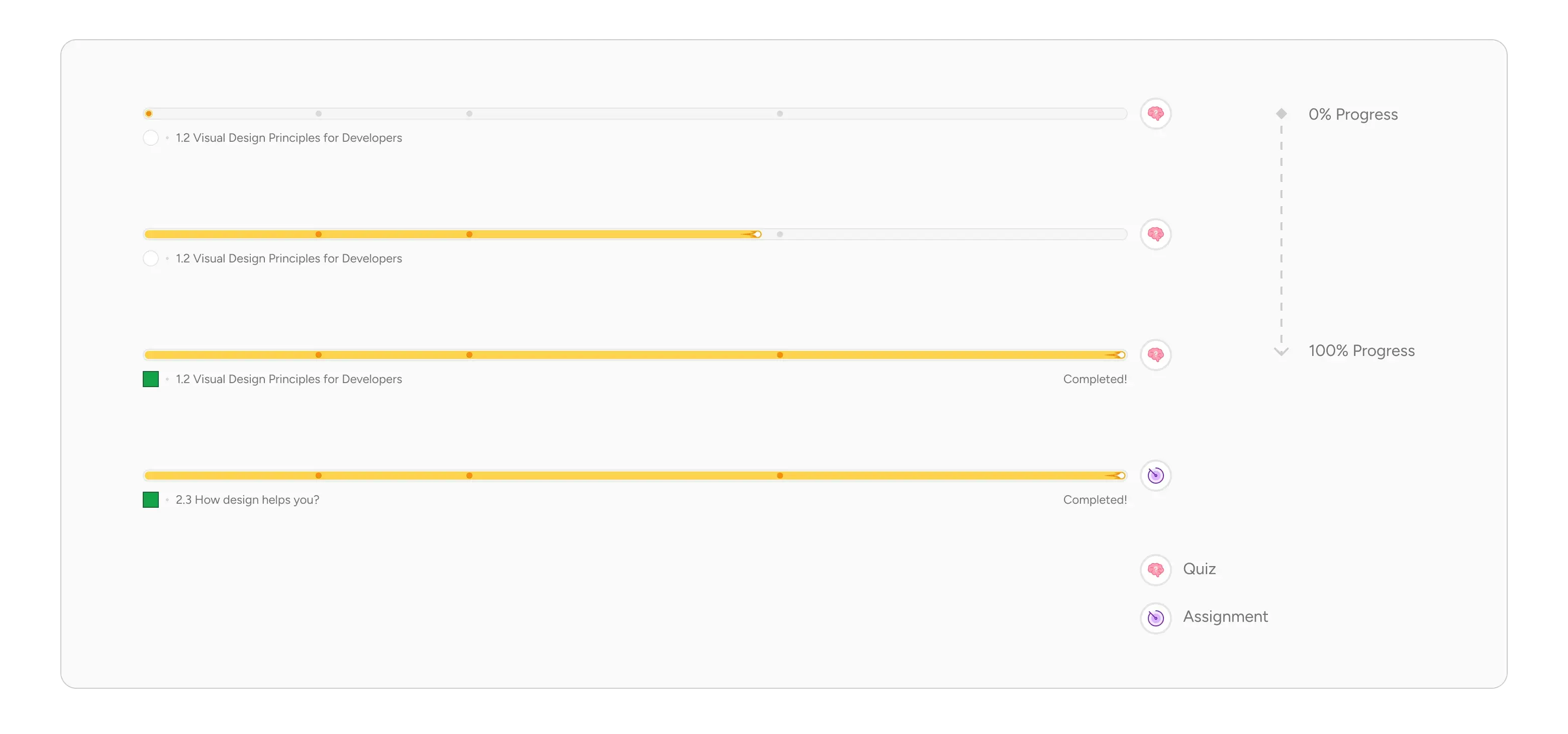
Module-Level Grouping: We recognized that simply listing Learning Units could still be overwhelming. By organizing LUs into expandable and collapsible modules, students gained better control over their content view. They could easily manage what they saw and quickly identify related content, improving content discoverability and organization
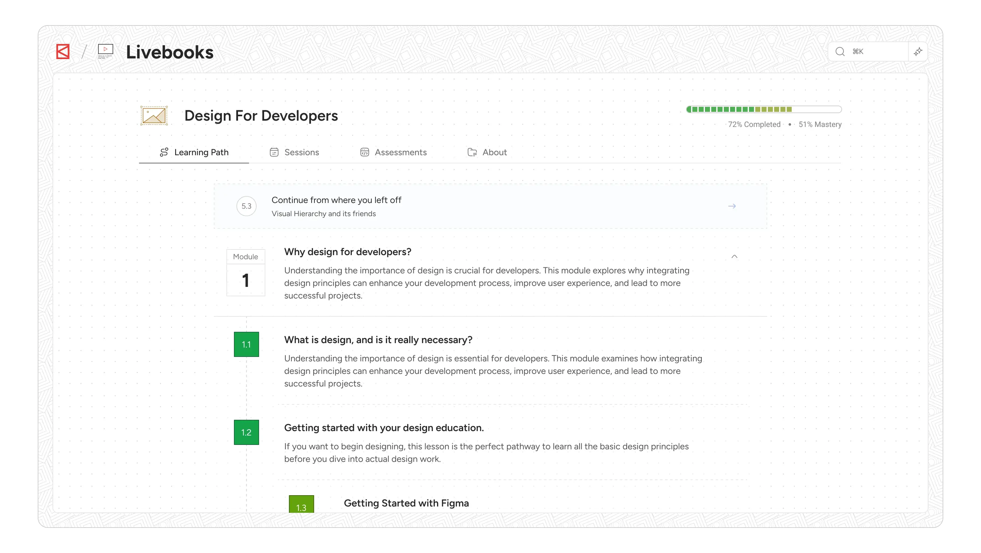
Continue from where you left off: This was a non-negotiable for continuity. The system now tracks a student's last consumed learning unit and automatically navigates them directly back to that specific point, skipping any intermediate pages. This includes not just landing on the correct page but also auto-scrolling to their precise last-viewed location within the content, ensuring they pick up exactly where they left off. This is about respecting the user's time and attention.
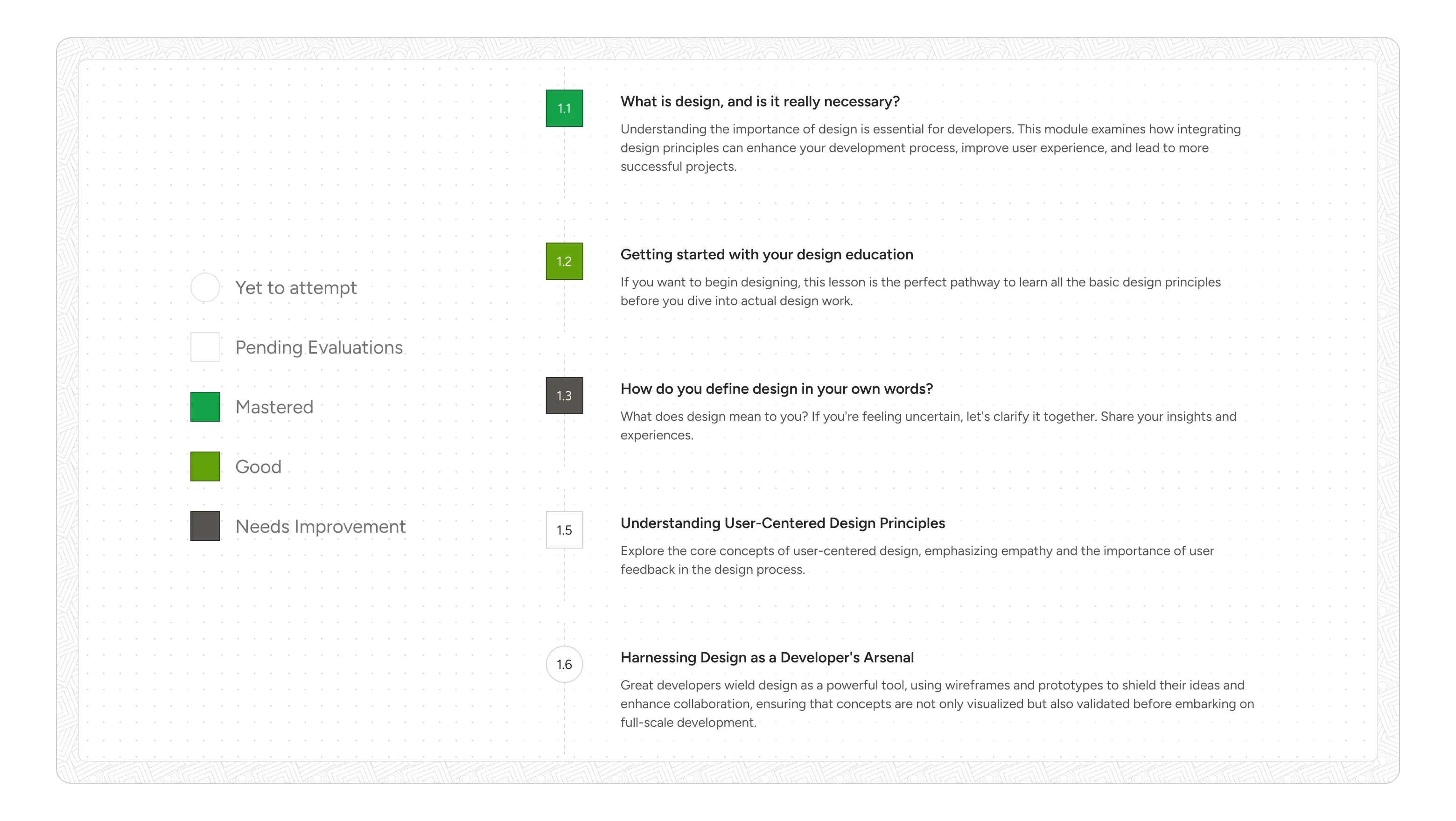
Unified Learning Unit Legends: A small but critical detail was addressing student confusion with previous visual legends like "circles" and "squares". We simplified and unified these, deprecating the "Conceptual Learning Unit" and "Practical Learning Unit" distinctions, bringing them under a single "Learning Units" umbrella with clearer visual indicators. The legends are always available for quick reference.
The Consumption Experience (Lesson Page):
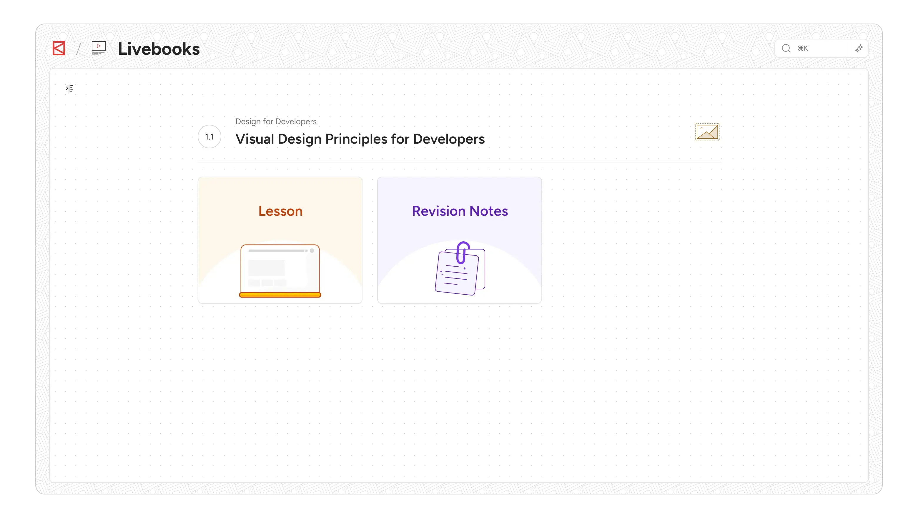
Intermediate LU Detail Page: Upon selecting a Learning Unit, students are taken to an intermediate page. This page clearly presents two main components: the "Lesson" and "Revision Notes.
Distraction-Free Study Mode: The "Lesson" itself opens in a full-page modal. This was a deliberate choice to provide a truly distraction-free environment, minimizing navigation elements and external influences, much like reading a focused article online.
Content Width Constraint: A seemingly minor detail, but crucial for readability. By restricting the content to 1024px width, we ensured less eye travel and kept the user focused, enhancing engagement, particularly for long-form content. This is a proven pattern for optimal reading experiences.
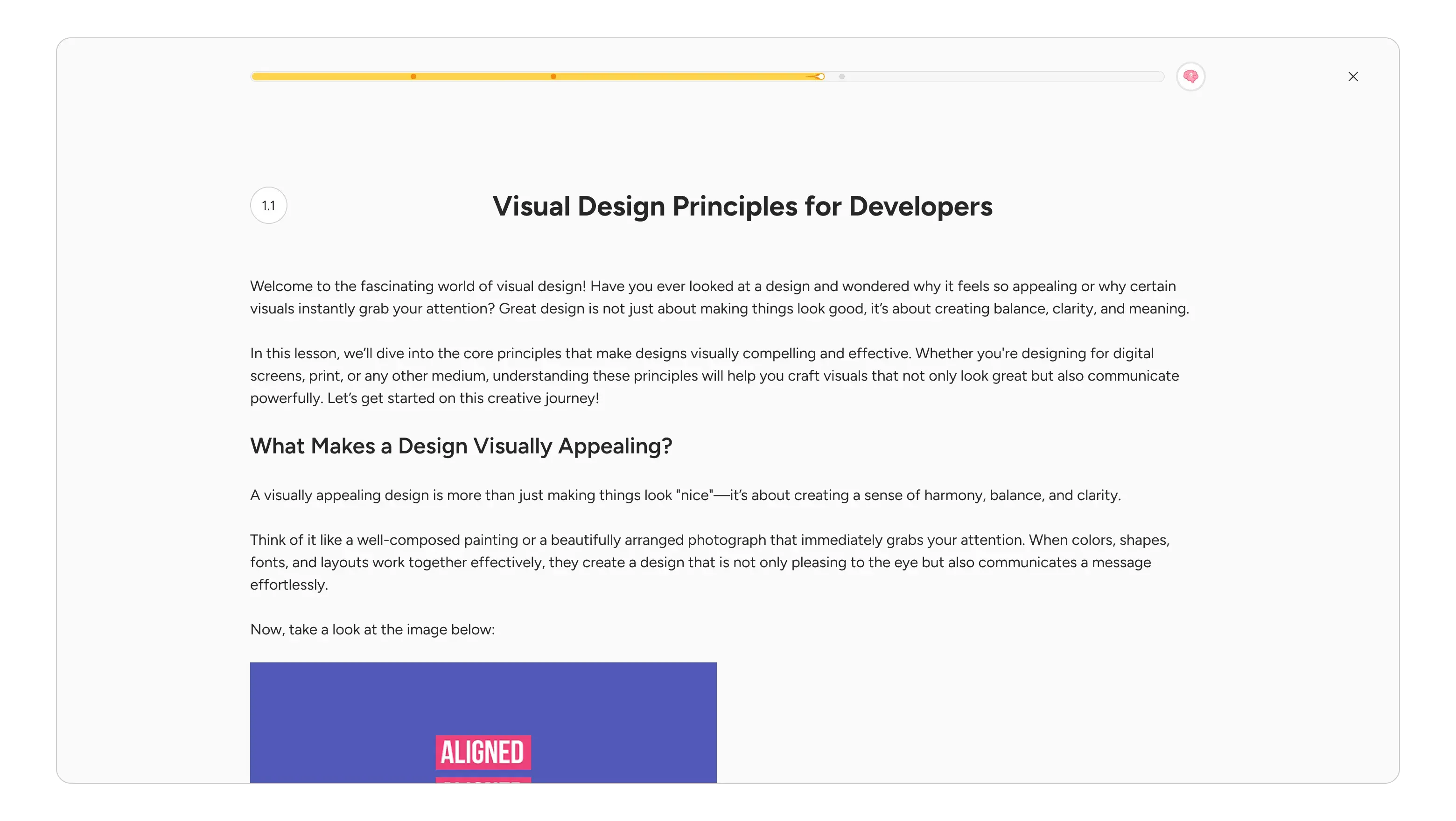
Scroll-Based Progress Bar: At the top of the lesson page, a dynamic scroll-based progress bar indicates how far along the student is in their consumption. It visually updates as they scroll, and also marks H1 elements with dots, changing color as they pass through, providing a visual map of the content structure. A small, clever snippet also appears at the bottom of the progress bar if the main title scrolls out of view, ensuring context is always maintained.
Rich Content Support: The learning page supports a variety of content types, including multimedia (images, videos, gifs), code blocks, and quotes, ensuring a dynamic and engaging learning experience.
Integrated Formative Assessment: A key improvement was ensuring that every lesson now includes a formative assessment, either a quiz or an assignment, represented by a clear widget at the end of the lesson. This encourages immediate application of learned concepts and provides critical feedback.
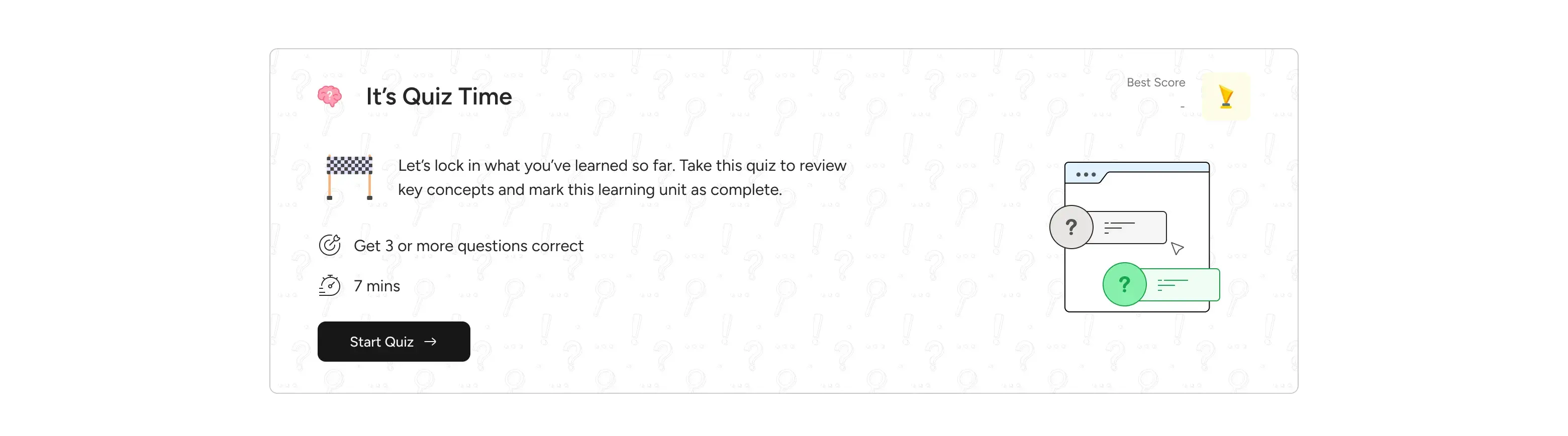
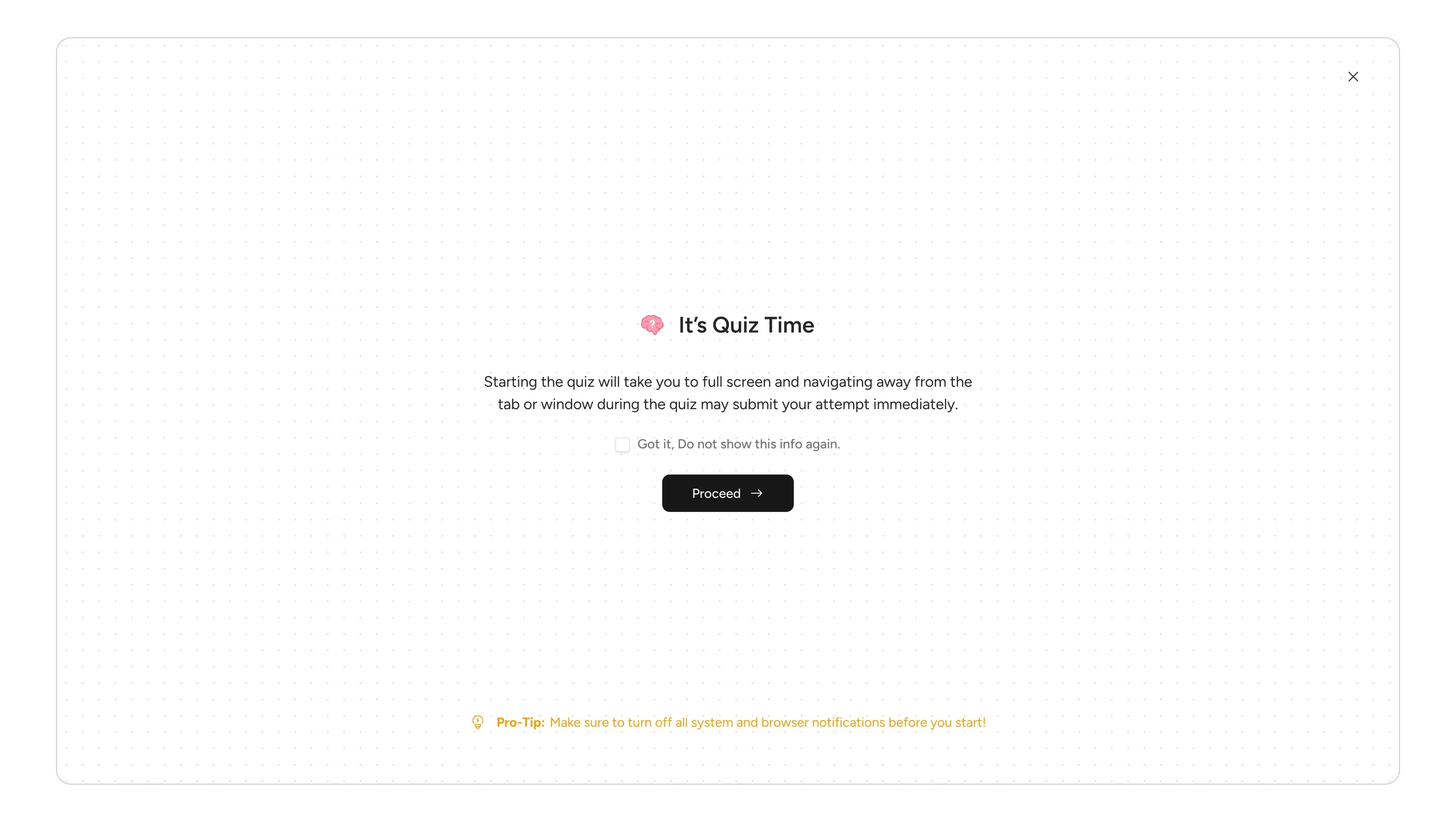
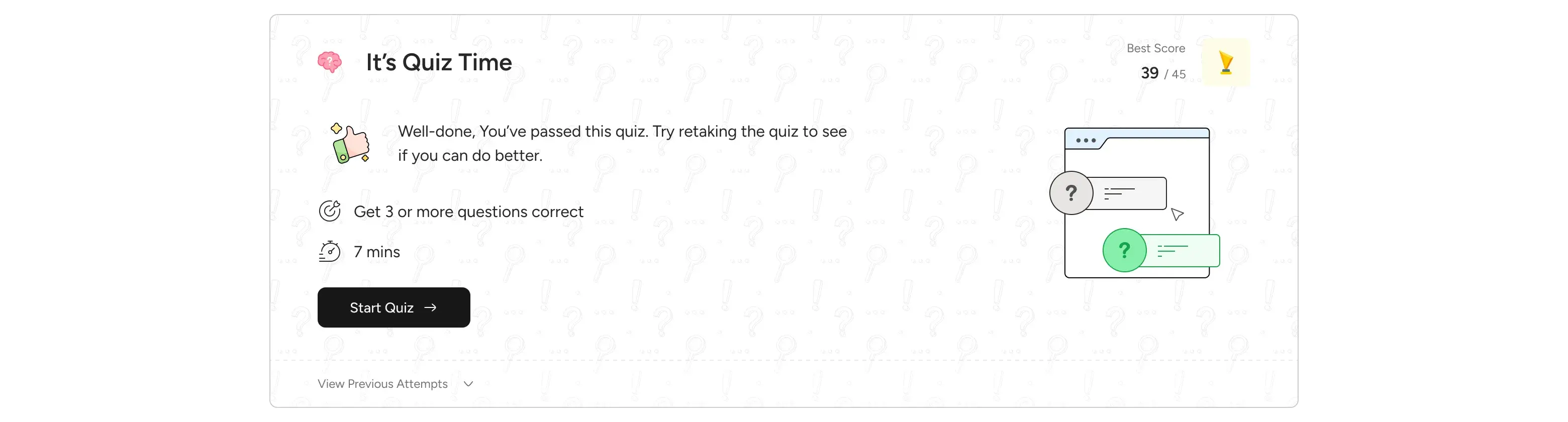
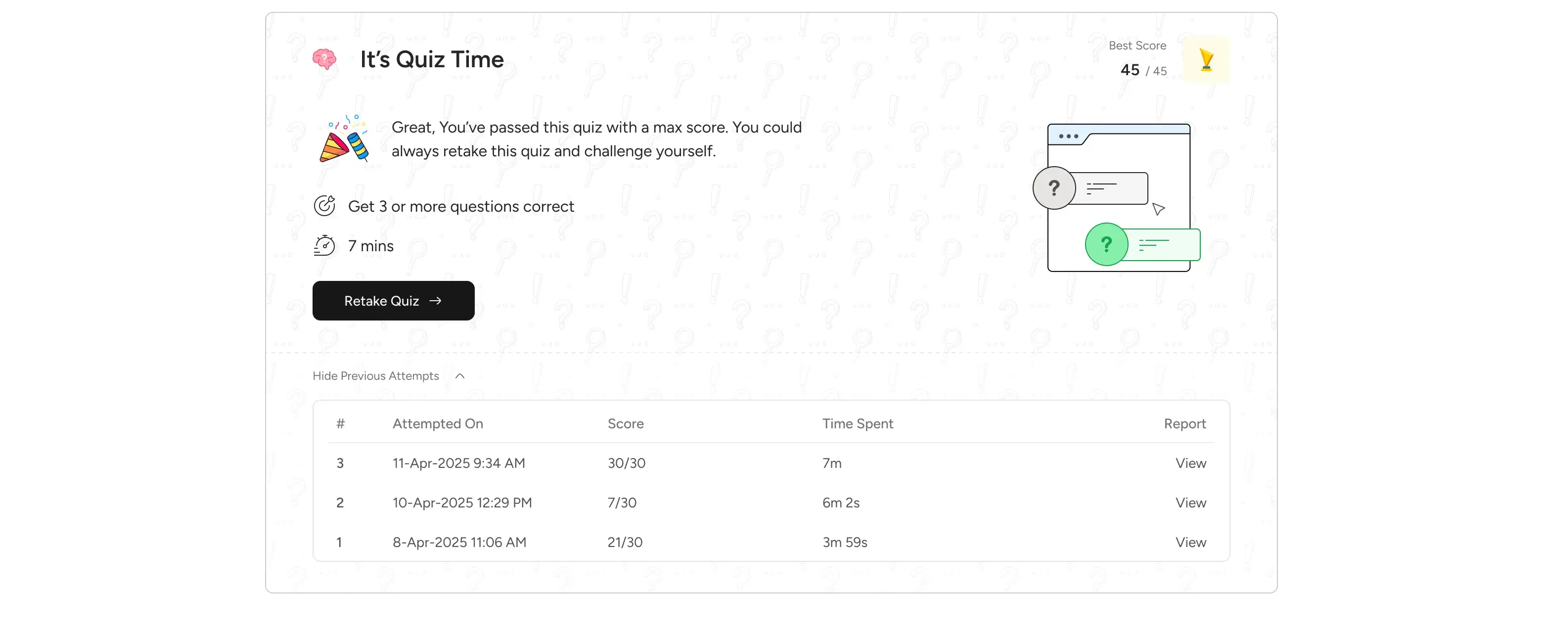
Quiz Experience: When a student initiates a quiz, it now transitions to a full-screen browser experience. This isn't just a full-page modal; it's designed to prevent users from easily exiting during the quiz, as a quiz is a short, focused event.
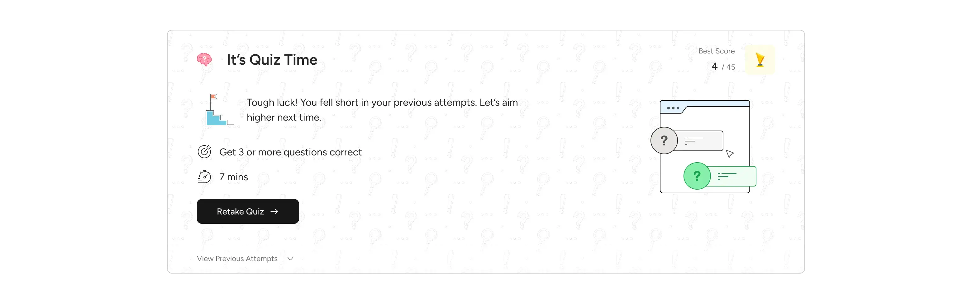
Before starting, a confirmation modal reinforces this commitment. Post-completion, students are taken back to the lesson card, where they see confetti for perfect scores or a pass, and an updated status card.
This status card is dynamic, providing tailored messages based on their performance (e.g., "Great you have passed," "Well done," or "You failed") and offers clear options to retake or view previous attempts and reports.
Assignment Experience: In contrast to quizzes, assignments are not a full-screen browser experience, allowing students the flexibility to exit and return to continue their work. This acknowledges that assignments might require more extended effort and external resources. The interface displays clear question and response components with a submission call to action.
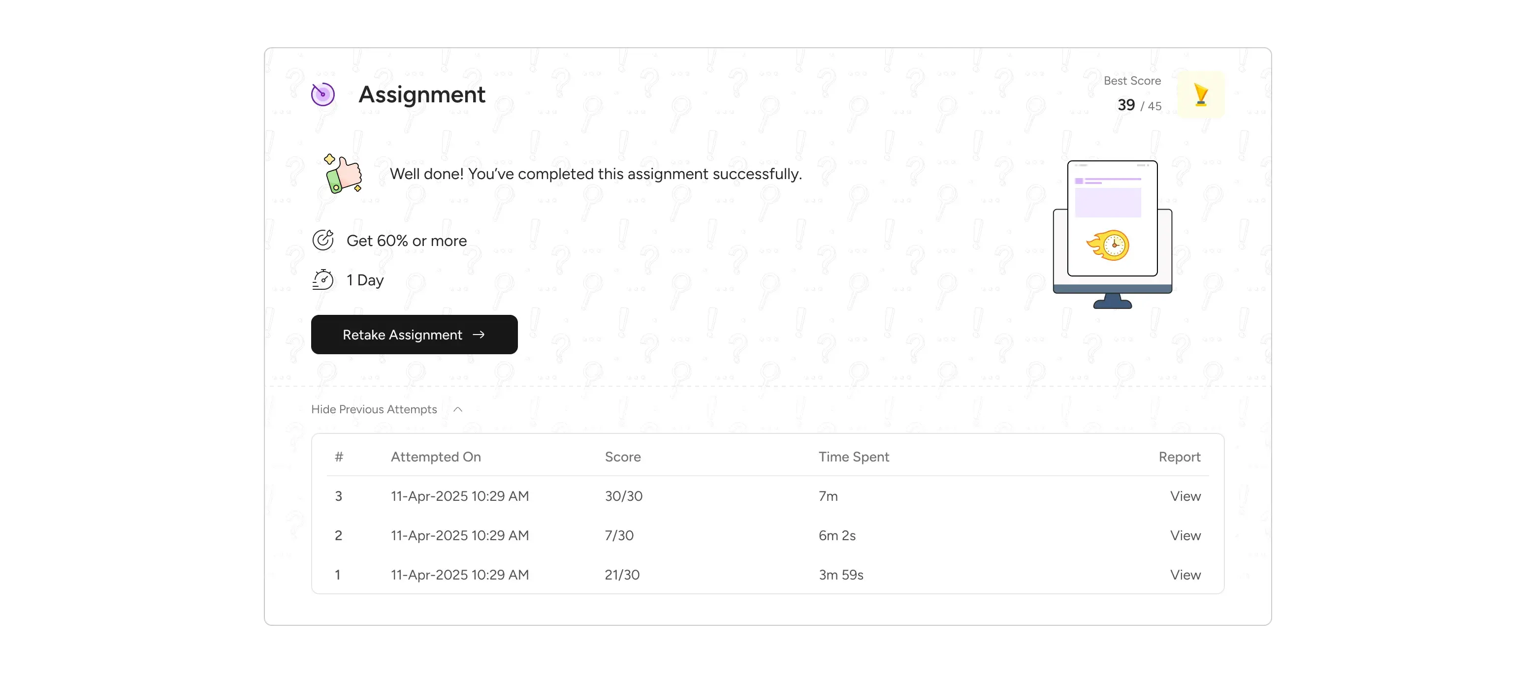
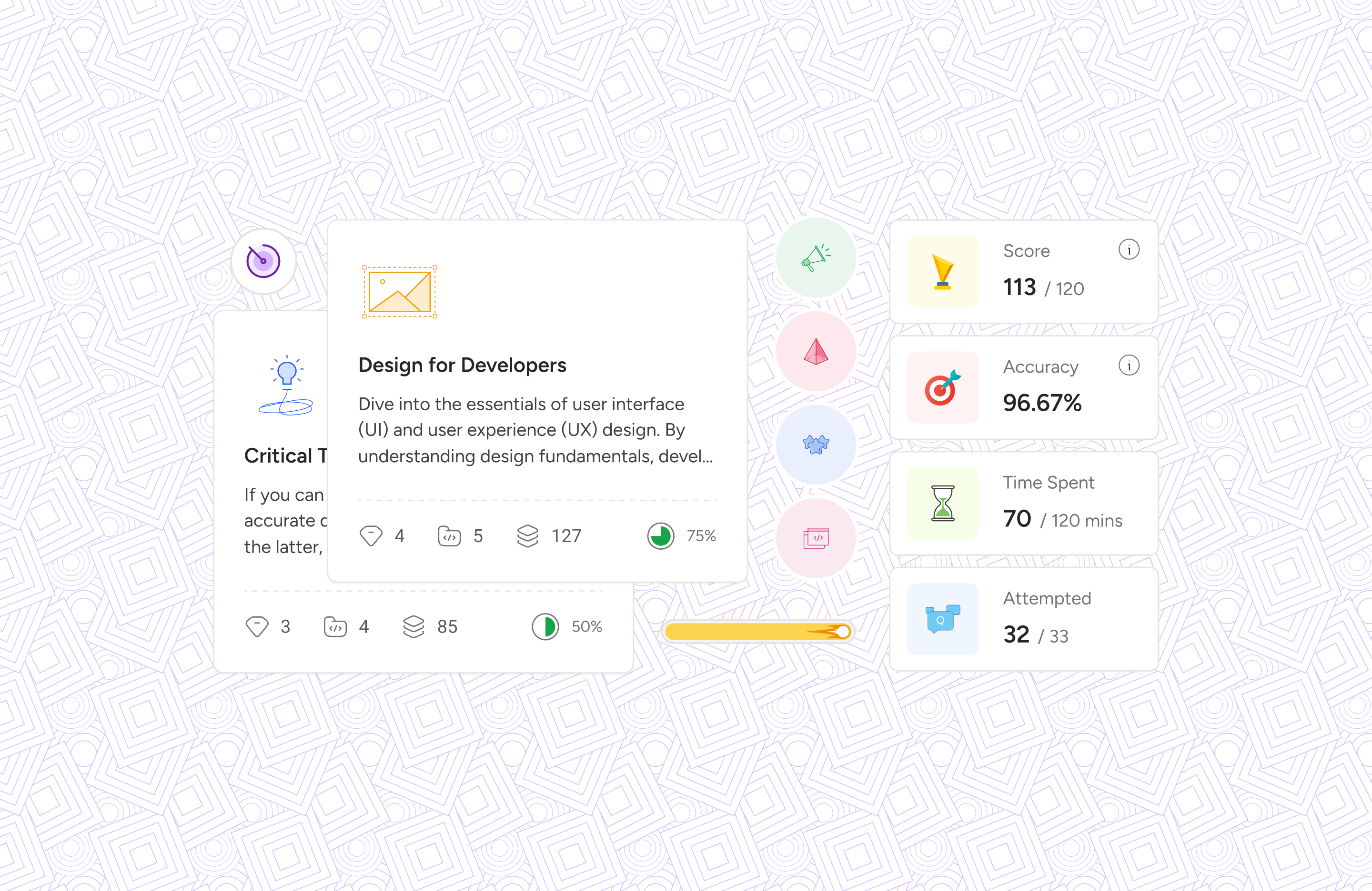
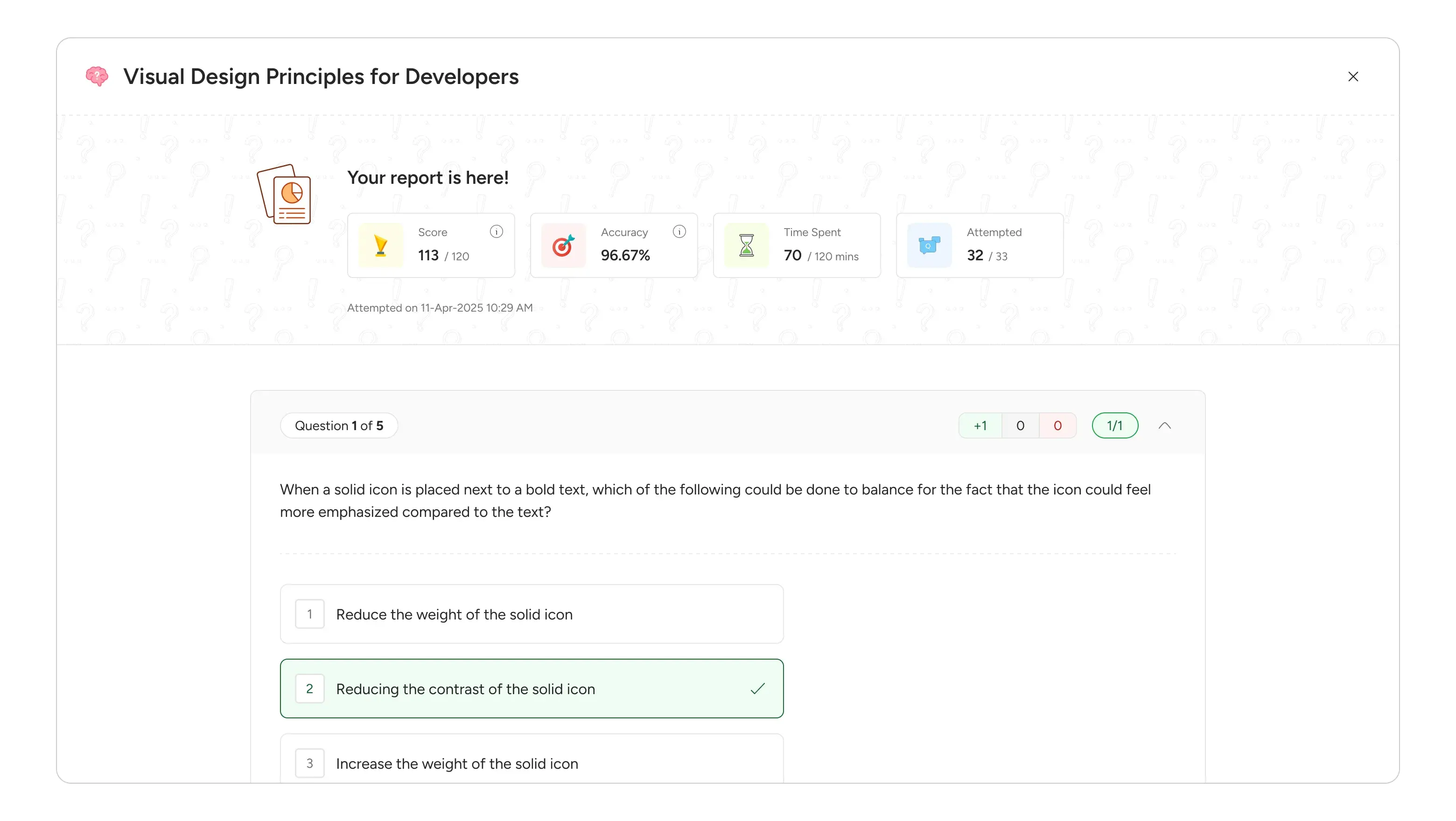
Standardized Assessment Reports: A key decision was to unify the report view for both quizzes and assignments. This standardization minimizes cognitive load for students navigating different assessment types. The report itself is data-driven, displaying key metrics like score, accuracy, time spent, and attempted questions.
Improved Session & Attendance Tracking: Staying Organized
The "Sessions" tab was conceptualized as the student's central hub for all scheduled and past sessions related to a subject.
Prominent Attendance Display: Right at the top, students see their overall attendance percentage for the subject. This provides immediate, high-level feedback on their engagement.
Organized Sub-Tabs: We introduced "Scheduled" and "Past" sub-tabs. "Scheduled" acts as a personal calendar, listing all future sessions with date, time, and title. "Past" serves as a historical record, but with a crucial filter: only sessions actually initiated by a facilitator and with attendance recorded will appear, ensuring relevant data. For past sessions, students clearly see their "Present" or "Absent" status.
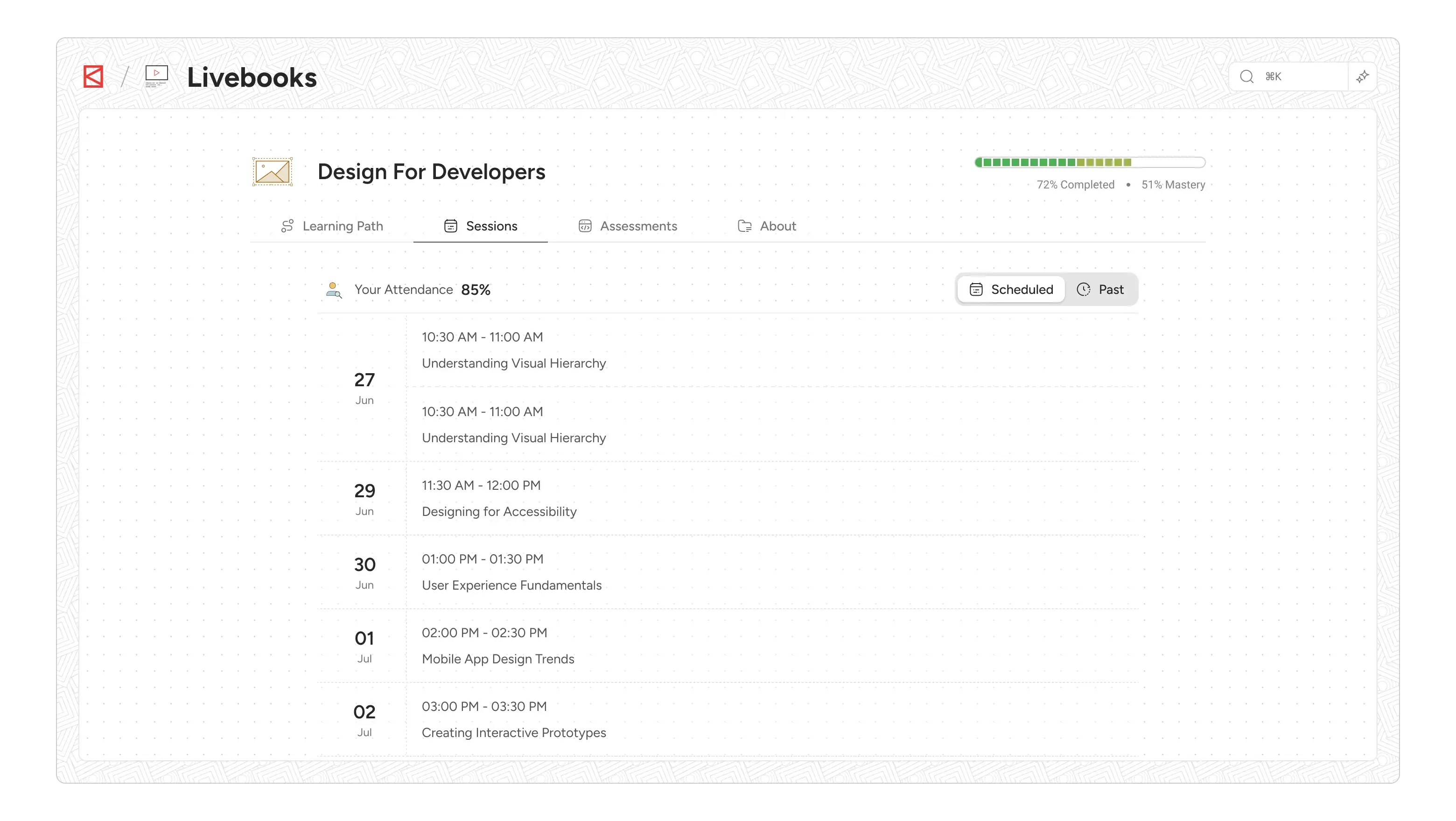
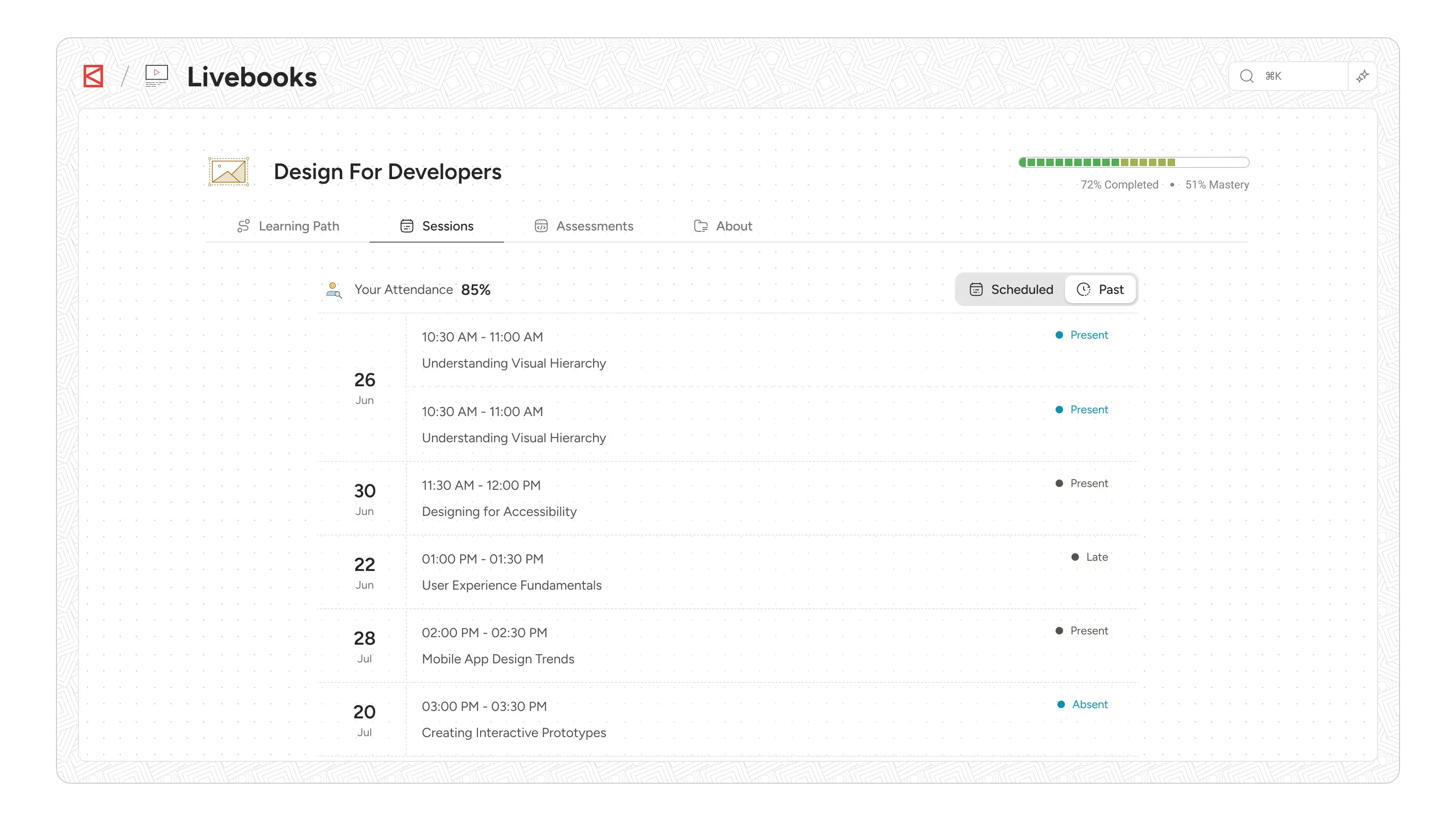
Direct Consumption: Clicking any session, whether scheduled or past, directly navigates the user to the session's consumption page. This minimizes intermediate steps, providing quick access to content or details
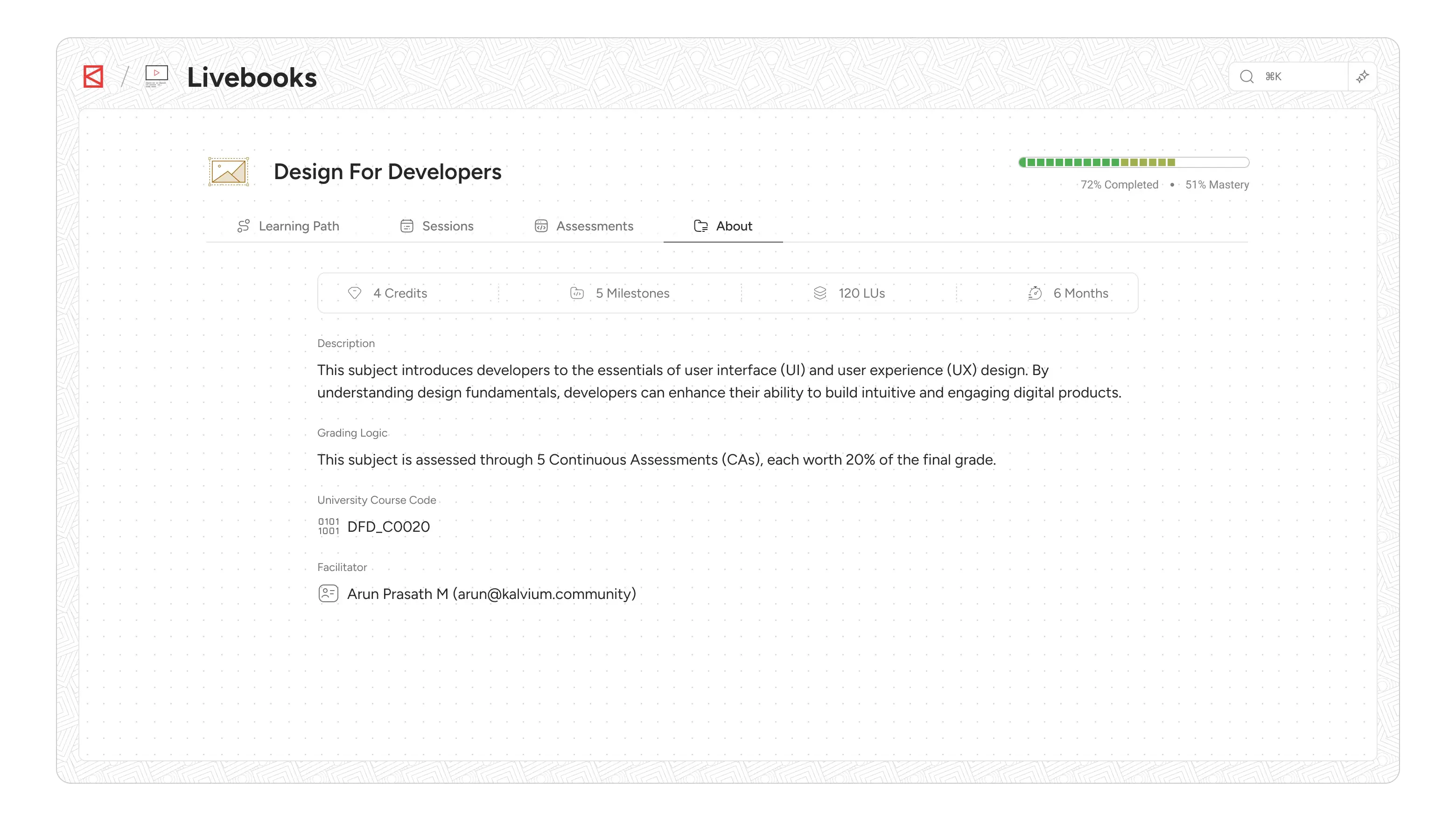
About Tab: Foundational Information at a Glance
The About tab serves as the definitive source of general information regarding the subject. It's designed to provide students with a clear understanding of the course's structure, expectations, and key administrative details.
Our intent was to create a single, easy-to-find location for all foundational subject information, avoiding the need for students to hunt through various pages. This section aggregates crucial metadata about the subject that includes Credits, number of Milestones/Assessments, Total Learning Units (LUs), Time estimated to complete the subject, grading logic and facilitator info., which are vital for student planning.
The Iterative Loop and Collaborative Spirit
Throughout this journey, our design process was an iterative loop: from understanding user pain points and defining clear problems, to generating ideas, sketching, wireframing, and refining into high-fidelity mockups
The collaboration with our engineering team was paramount, especially when making foundational structural decisions like the shift to "subjects" and the four-tab architecture. We leveraged our existing design system components and tailored them where necessary, ensuring a consistent yet optimized experience across the platform.
Livebooks v2 isn't just a product; it's a testament to how deep user understanding, a clear problem definition, and thoughtful design decisions, all supported by strong collaboration with engineering, can transform a core platform. It's about empowering students with clarity, continuity, and a truly distraction-free learning environment, setting the stage for even greater engagement and success.